|
The Usability Company helped ensure users were at the heart of Bradford & Bingley's website redesign.
Bradford & Bingley's Marketplace, (www.marketplace.co.uk), is a website where you can peruse a wide range of financial services and products from third party providers, as well as the company's own deals. There was no shortage of people browsing the property, mortgages, credit cards and insurance products, but Bradford & Bingley were concerned there was too much window shopping going on.
"The site was underperforming in terms of its potential," says Bradford & Bingley Head of E-commerce Russell Gould. " We had the experience of developing the Charcol online site and we knew that the two sites performed very differently. In particular, the conversion metrics were very different on the Marketplace site compared to the Charcolonline site, which operated off the same platform but had a different customer interface," he says. "The Marketplace site had more users than Charcolonline but was getting fewer mortgage applications."
Bradford & Bingley decided that after three years, the site was due a redesign. "The whole principle was that we wanted to build something that was user-centric and tested with users every step of the way," says Gould. "You can spend a lot of money doing a lot of nice neat stuff and end up with something nobody wants to use. It was critical we had an understanding of how users want to use it and then built to that spec."
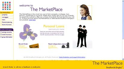
The Marketplace website in 2003 before the redesign
The company had worked with The Usability Company on redesigning Charcolonline. "We were very impressed with what they did," says Gould. "When we first kicked off the site redesign project, we told them we'd like them to be involved and they talked us through their new technologies and the partners they had been working with."
The usability study begins
The first step in the project was to understand current use of the website. To do this, The Usability Company used WebIQ. This software, developed by The Usability Company's strategic partner Usability Sciences Corporation, enables site visitors to be polled on their intentions on entering the site and their success at achieving what they set out to do as they leave.
WebIQ's power lies in its intelligence: the answers visitors give at the start and end of their visit are matched up and the user's journey through the website can be tracked. Tracking can go beyond clicks to record cursor movement. Over a short time, WebIQ studies can deliver detailed and quantifiable data for analysis. This data is detailed enough to provide a snapshot of each user's visit, unlike simple polls or surveys which just total votes.
"We wanted to understand what customers come to the site for," says Gould. "We also wanted to know whether we satisfied their requirements and wanted a view of how they saw Marketplace in general - the brand and what people thought it represented."
"WebIQ was absolutely effective," he says. "We implemented an opt-in at the start of the session where we asked consumers if they would help us improve our website. They were then asked about five questions about their intent - where they came from, how they found the site and what they thought of us. At the end of the session as they were leaving, we would ask the same questions reworded slightly differently: 'You told us you were coming to the site to do this. On a scale of one to ten, how successful were you?'"
The WebIQ study enabled The Usability Company to:
- Identify how many visitors were existing customers and how many were potential customers;
- Discover that just over half the visitors were first time visitors;
- Break down the reasons for visiting the site in percentage terms;
- Discover limitations in the mortgage search which were causing dissatisfaction; and
- Establish benchmarks to measure the redesign against.
Designing the information architecture
During the project, The Usability Company's Head of Information Architecture Tobias Misera worked extensively in Bradford & Bingley's offices. At the outset, he visited Bradford where the mortgage applications are processed. He learned what happens behind the scenes when customers click 'apply' and spoke to call centre staff about the most frequent problems callers have with the website. For much of the rest of the project, he worked out of Bradford & Bingley's London office.
"This way I could introduce myself to the stakeholders," he says. "People saw me around and knew what my role was. It was easier to ask people questions on site than just picking up the phone and trying to get through to the right person."
"It was critical for Tobias to be part of the day-to-day project," says Gould. "You can't just sit on the outside. You have to live and breathe it."
From the WebIQ results, Misera had a clear idea what customers wanted and from his own interviews at Bradford & Bingley, he had a clear insight into the business's objectives for the website. The next step was to begin designing the structure of information on the website.
The existing content was written onto cards and arranged alphabetically. Users were asked to sort them into what they thought was the right order for the website.
"It was a great help," says Misera. "It enables us to look at how users would arrange content and then we can see how that compares with what the business wants to achieve. We always make a point of saying that it's user-centred design, not user-driven design. We take the user data into account, but reserve the right to interpret that as best for the business."
Internal testing
The 12 test users were drawn from Bradford & Bingley's own staff who mostly didn't have direct involvement in the website.
"We didn't want to spend a ton of money on the early testing side of things," says Gould. "At every stage we would get staff internally to test, some of whom were involved in the website and understood how it works and others who had nothing to do with the site in their day to day roles so we had the right cross-section of people."
"The structure they came up with was very different to what we had in place," says Misera. This structure was used as the basis for 'clickable sketches' known as wireframes which were developed initially in PowerPoint. These were used to
test the process, with users being invited to try out the navigation and asked for feedback. The early wireframes were also used to test whether the main navigation should be on the left of the page, at the top or a mixture of both.
"The existing site had a navbar on the left," says Gould. "Before testing we asked everyone what their view was. Most said the navigation should be on the left because it works best there. When we went into testing with the wireframes, the result was that 80% chose the top navigation structure. It highlights the fact that if we hadn't involved our people in testing and had gone with the top navigation, they would have thought it was wrong. When they saw the result, they said 'wow!' When you're used to something, you don't look at it from a different perspective. When you do tasks like a consumer, you can see the new navigation position makes so much more sense."
Fixing the navigation
"When WebIQ highlighted that a significant percentage of the traffic was property related, due largely to the site's high profile web link with RightMove's property search engine. We recognised the need to think up a smart way of redirecting that property traffic to other parts of the site," says Gould.
"The principle we started with was like a supermarket. We'd make it as easy as possible for them to find what they want, but also offer signposts along the way to other things that might help them. Like in a supermarket where you might go for milk and pick up some Nesquik and bread along the way."
Once someone has found property, they now have the option to get mortgage advice, see how much they could borrow, pick up a mortgage, or look at conveyancing. These options appear in a menu of additional services on the right hand side, the content of which varies according to the website section the user is visiting.
Final wireframes
"When we were sure we'd hit the right navigation model, we moved on to HTML wireframes," says Misera. "These were closest to testing on a real website because you have the browser environment. It wasn't about design - it was about what was on the page and how you navigate to that."
About 50 pages were mocked up as HTML wireframes, representing almost the entire site and imitating its functionality.
Improving accessibility
In recent years, the issue of website accessibility has become more widely recognised among website developers and owners. It's about ensuring people using assistive devices, such as blind people using screenreaders to hear webpages read aloud to them, can enjoy the same websites that people using mainstream PCs and web browsers can.
"There is a strong business case for accessibility," says The Usability Company's CEO Paul Blunden. "From Bradford & Bingley's point of view, they're a leading mortgage provider and broker. There is a large proportion of homeowners with disabilities, especially visual disabilities. The accessibility issue doesn't stop with people who are blind. A large proportion of the web population is older and their sight is deteriorating. A lot of accessible website design helps people who struggle late at night or with small text."
The Usability Company conducted an accessibility audit, aiming to meet the standards set down by the Royal National Institute for the Blind (RNIB) for its own 'See It Right' award. The site has also been designed to comply with the Web Accessibility Initiative's guidelines.
"Bradford & Bingley is very keen on making sure it provides access through all its different distribution channels to everyone," says Gould. "We needed to make sure we took the same stance on the website. We knew many parts of the site were not accessible. The audit highlighted to our development guys where the problem areas were and what things they should focus on improving."
"The accessibility requirements didn't constrain the design much because we were aware of accessibility from the beginning," says The Usability Company Director Marty Carroll. "It's a lot more difficult to retrofit for accessibility."
Design handover
The final wireframes reflected how users would expect to use the site, how Bradford & Bingley wanted to achieve its business goals and how the site can be made as accessible as possible. Bradford & Bingley's own marketing team had also been involved in deciding how to represent the brand and the language to use in talking to customers.
Throughout the project, Bradford & Bingley, The Usability Company, design agency Conchango and developers IBM had been in constant contact so they would all know the project background when it was time for each to do their work. Now it was up to Conchango to put skin on the bones and design the webpages.
"It was very important we worked with a company used to working with wireframes," says Misera. "Certain things could not change - the wireframes indicated the navigation for example. The agency couldn't just put things on the left without consulting us."
"We worked alongside Tobias to visualise the work he was doing as branded webpages," says Conchango Head of User Experience Paul Dawson. "We took a fairly iterative and collaborative approach to create the look and feel for the site while delivering the accessibility considerations required."
"We would consider The Usability Company as trusted partners," he adds "In some areas we complement each other. In others we slightly overlap. It's about finding the best fit for any given client. They come highly recommended in a field where the market used to be overrun. The Usability Company survived the dotcom bust for very good reasons."
Conchango often partners with usability specialists on design projects the company undertakes. "They bring objectivity to a website design project," he says. "Where clients want a truly objective body of opinion, we'd certainly look to bring in an external partner company. They bring formal usability methodologies, testing facilities and in The Usability Company's case a very tight relationship with the RNIB. It was the only company accredited to do the See it Right work at that time."
Once the design was complete, it was handed to Bradford & Bingley's development team at IBM with the Usability Company and Conchango handing over to ensure they understood the design and usability requirements.
The final website was subjected to a round of testing with 8 members of the public in The Usability Company's London usability labs to identify any remaining minor problems and ensure the site delivered on its promise.
"Because we had taken a user-centred design approach, the things we identified in lab testing were not as significant as if we hadn't taken that approach," says Carroll. "We were fine-tuning the usability the whole way through."
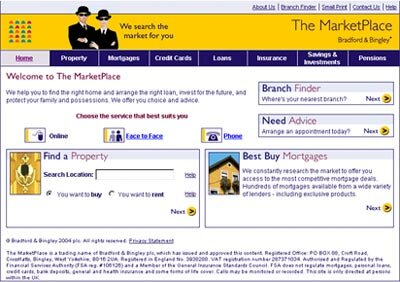
The Marketplace website in June 2004 after the relaunch
Reaping the benefits of user design
"The result speaks for itself," says Gould. "The principle was to make personal finance as simple as possible in a web environment. We've already seen some really encouraging behaviour changes and users seem to be making more of the core personal finance aspects of the site" says Gould. "
The usability work was completed to time and budget. "That's what we expected of The Usability Company, which is why we hired them," said Gould. "On a scale of one to ten, I'd give them ten. We're extremely satisfied with the work The Usability Company has done."
"The key benefit of user-centred design is that you end up with something that is inherently usable," says Blunden. "If you test at the end of building the site, you have problems you can fix and those you can't which are usually to do with the information architecture and structure. Our user-centred design approach eradicates this problem completely. When you hand over to design you have a structure that is usable and reflects the users' and the business's requirements."
"The user-centred design approach isn't cheaper," concedes Carroll, "but it is wiser because the site works when you launch it. After launch, you're not trying to fix things at great expense because you've identified any issues during development. It's cheaper in the long run but the cost of development is the same for the client."
For more information
If you'd like more information on this case study - or would like to talk about how we can help your business - please call Funmi Tomisin on or email me at .
Return to newsletter
|