Introduction
This month we take a look at one of the webs' leading retail sites to evaluate its' purchase process.
Allders website homepage layout reflects their new 'Fusion' shopping concept. This new way of shopping has been created exclusively for Allders and presents zones, based on the way 'we live our lives today'. The main headings – content labels – present options such as 'Living', 'Giving' and 'Electrical'. All seem intuitive and are presented neatly in different coloured boxes, although the lighter shades could cause reading difficulties for some users.

The home page doesn't convey any messaging about what sets Allders apart from its competitors and in fact there was, at the time of writing, a promotion for Tesco club card points that drew attention. The lack of messaging is probably explained by the high focus on Christmas, which is too be expected at this festive time of year.
Objectives
Our review was based on finding and purchasing that seasonal favourite - a dressing gown for a man.
Back to top
Findings
From the headings we selected 'Sleeping' as this seemed the most appropriate section for our purchase. However on clicking through we were presented with bedroom products (Bed linen, Beds, Duvets, Pillows) and not bedroom clothing.
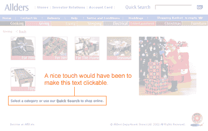
Our next selection was living where we found a wide range of homeware but alas no dressing gowns. Finally and probably we should have tried sooner, we looked at 'Giving'. Here we instantly found the category we were looking for and selected the 'For Him' option. Unfortunately here we were presented with two options or sub-categories, gadgets and grooming, neither of which was suitable. We were however advised to use the Quick Search facility and also note that this was available on the home page. A good aid to usability would have been to make the instructional text clickable, but the Quick Search box was clearly visible in any case.
Back to top
Putting 'Dressing Gown' in the quick search facility provided a range (5) of options, each with a clear graphic and price. Instructional text was provided that invited us to click on the image for more details. We selected the Polar Fleece dressing gown and were taken to the next screen.
Allders site provides a breadcrumb that allows us to establish where we are in the site. At the dressing gown selection page we are in the 'Giving' zone.
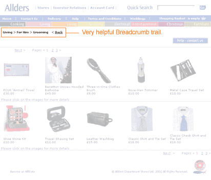
The breadcrumb trail is very helpful but starts to raise questions about how intuitive the category labels are. Perhaps a further category titled 'Wearing' would be helpful? In any case the quick search facility was very helpful.
Back to top
The selection screen we are then presented with is very good, easily understood and clearly labelled.

From this screen we can enlarge the image for a closer look, find out about washing instructions and the fabric content. There is a nice sales message too, albeit below the fold.
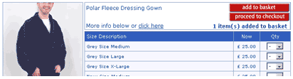
We select a grey dressing gown, size large by selecting '1' in the quantity drop down menu. The site provides two choices now, to continue shopping by 'add to basket' or to 'proceed to checkout'. As this is all we want we click 'proceed to checkout'.
Back to top
We then find we needed to add the dressing gown to our shopping basket before proceeding to checkout and use the back button located by the breadcrumb trail to return. Unhelpfully the quantity field is now blank but as we are only interested in one item this is not a big problem. It would have been frustrating if we had selected multiple products.
We then select 'add to basket' and are presented with the following screen.
The quantity has been reduced to zero and the site tells us 1 item has been added to the basket. From a usability perspective users could miss this and we have seen it happen in the lab. Best practice would be to show the basket at this point so that users can confirm what they have added before proceeding.
When we do proceed to the checkout we are presented with a very clear shopping basket page, which provides the ability for us to check delivery, amend the quantity and have another look at our selected product. The links that are clickable are very clearly clickable, adopting the convention of underlined text.
The only criticism of this page is that the process bar has replaced the breadcrumb trail so that at first glance users may not be aware that there is a process indicator available. There would be usability benefits in presenting the process bar in a different way to the breadcrumb trail.
Back to top
At the checkout screen a really usable feature is that you do not have to register to purchase, and in fact we have not been asked to register at any stage until now. We are asked at this stage but we are made aware of the benefits of registration with a simple sentence:

Sentence reads: You don't have to be registered to shop on allders.com, but if you are, enter your email and password here to help us to fill in your details automatically
If you want to register you are presented with the option further down the page and find that most of the work you have done in completing the checkout form goes toward the registration, with the user only needing to select a password.
As we complete the form all seems straightforward, however as with most forms on the web there are issues. In the address field we are presented with a delivery type box. The default is 'Special Delivery' and the alternative is 'select'. We have to assume that the delivery we are getting at £3 is special but this makes us look more than once. At the delivery screen we are provided with alternatives for delivery to billing address, which saves some legwork, or to an alternative address. Even a work address field is available!
Back to top
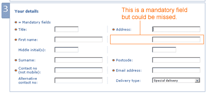
Submitting at this point uncovers a usability issue. Although the form is apparently complete the second line of the address is missing. This is not highlighted clearly as a mandatory field as shown below:
The error message that was presented however was very clear and instructive, and we feel that most users would be able to follow the instructions and correct any mistakes they may have made.

Error message reads: Either the following data was entered incorrectly or is missing: Please enter the second line of your customer address.
Finally we were presented with a clear and friendly confirmation screen and a reference number that was followed up almost instantly with email confirmation.
Summary
Although there are some usability issues the Allders website contains some nice usable features and a very clear and easily read style, once you get beyond the home page. It is unlikely that many customers would fail to purchase once in the process, although they may become frustrated at the early stages. We consider the key usability issues that could be improved are the category labels and the screen that follows – add to basket.
All we can do now is await the arrival of our new dressing gown!
Return to newsletter
|