USEworthy July 2002
|
|
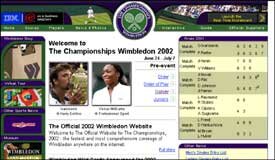
The navigation menus are descriptively labelled, easy to locate and are always easily accessible at the top and left hand side (LHS) of the screen. |

|
Descriptively titled pages, showing the name of the current section and subsection, provide a sense of where the users are in the site. However, highlighting the name of the current section in the navigation bar could further enhance this. |
Content
The visual and textual information have great clarity and manage to pack in a great detail of information in an easily digestible manner.
The site is very content rich, but the users are not overwhelmed as the information is provided via progressive layers of detail. This allows the users to drill down through the links for as little or as much information as they require.
Even the tables are clear and well presented.
The 'Did You Know?' section at the bottom of each page provides interesting Wimbledon-related trivia.

Screenshot 2: Player Profile showing optional links for further information.
Search
Keyword entry is not very forgiving. Many of the tennis players' names are uncommon and difficult to spell. Mechanisms in use now that are becoming popular are features on Google such as 'Did you mean Hingis?' when the user has perhaps misspelled the name and typed "Hengis", so the user can choose to accept the correct spelling and do a new search with it if s/he wishes to.
However, at least the keywords entered are currently reiterated at the top of the search page, which allows users to check whether or not they have made a spelling mistake.
The total number of matches found is also displayed as well the matches currently being shown. This provides users with a good sense of the size of their result set. Most users do not go past the first or second result pages, so the provision of a weighted list is very useful as it ensures the more relevant matches appear at the top of the search result list.
If a large amount of results are obtained there should be an option to refine the search and if very few or no results are returned there should be an option to broaden the search. It is good practice to provide facilities to broaden or refine a search rather than 'dead-ending' users with no results or overwhelming them with too many.

Screenshot 3: Search results page showing results weighted by closeness of match to the query.
Virtual Tour
This section has a very clear layout, directing the users to the key features, rather that distracting and confusing them by providing too much content at once.
The pictures and 360 degree panoramic views are of good quality yet have impressively quick download times. The 360-degree panoramic facilities are quick to download, intuitive to use and easy to control.
Some of the map graphics are let down by the use of labels that are too small to read and by un-descriptive Alt tags, for example, the Alt tag for the map of the grounds is "sitemap" which could easily be confused with a website sitemap.

Screenshot 4: Virtual tour home page.

Screenshot 5: Virtual tour panoramic function.
Wimbledon Shop
Products can be accessed via the 'Directory' or 'The Collection' categories on the LHS, but either way the users can quickly select and purchase products. This is quite an efficient process and the details to fill-in are kept to a minimum, with no required registration to impede the process.
Nice provision of an enlarged section of the product helps users simulate a real life inspection of the product detail.
Usefully, a summary of the basket is constantly available on the LHS of the screen. It shows the details most users want to have readily available: the number of items and the current total price. There is also a link to the checkout/basket, to allow users to checkout or amend the basket quickly.
There is no indication of what section the users are currently in. This means they have to remember the section name as there are no "Previous" or "Next" navigation controls and the users must select the correct category to see the listing of items again. Highlighting the current category would indicate to the users where they are on the site and providing navigation controls would allow the users to move more freely around the shop.
Any errors made when entering data are returned one at a time instead of all together in one go. Users get irritated when they are 'drip-fed' errors one at a time and have to waste time continually going back and correcting them. If a page is returned with errors users expect that list of errors to represent all the errors on the page. If possible, report all the error messages together, and highlight the field labels that need to be corrected.

Screenshot 6: Shop home page.

Screenshot 7: Product page showing lack of any navigational controls and no indication of what the current category is.
Overall score
TUC has evaluated hundreds of websites and done thousands of hours of user testing. We have found this site exemplary in usability terms and have awarded it a score of 8 out of 10. Although many features won't be available until The Championships, June 24th – July 7th, there are already some noteworthy sections, such as the 'Museum' and the 'Virtual Tour.'
Accessibility
When a site is accessible it means disabled users can use it. This site was tested against accessibility guidelines set down by the Web Accessibility Initiative (WAI) and was found to be very accessible.
Usability: An Introduction
Part VI - Total Design
Watching the World Cup for the last few weeks I've heard the term Total Football crop up from time to time. For those of you not au fait with the term, it's used by the pundits to describe a style of play that covers all aspects of the Beautiful Game. Some teams are stronger than others in some areas e.g. attacking, defending, passing, etc but a combination of skills is required to get a positive result. No one part of the game can exist without the balanced support of the others. A team that attacks well but cannot defend, or passes well but cannot shoot will find it hard to win.
On the digital design playing field a similar 'Total Design' strategy can be implemented to get the best results. How many factors go into producing a successful product? Once a concept has been formed, the four major players in digital design are:
1. Usability
2. Accessibility
3. Information architecture
4. Visual design
It is hard to imagine any product being successful in today's market without a significant contribution from each of these players. A site with bad information architecture cannot be easily navigated, a site with bad visual design cannot be interpreted, a site with bad usability does not allow users to complete their goals, and a site with bad accessibility is exclusive of some users instead of inclusive of all.
On past occasions, web design has relied on a heavy contribution from visual design to attract users, but today's successful sites cannot be built around aesthetics alone. Usability, accessibility and information architecture are vital to product success, however this does not relegate visual design to a back seat. After all there is no point in constructing flawless information architecture only to make the site unusable by applying an aesthetic that makes it hard to read information.
Sometimes it is a lack of visual information that leads users to miss-interpret instructions. In this example from a transaction screen, dropout was very high. Users filled their shopping baskets but on reaching this screen would not proceed any further. Why? Looking at the design it was impossible to work out. It was a very simple screen, the visual design was clear and no problems were discernable. Usability testing however revealed the users were entering their credit card number including the spaces as shown on the card. This was not acceptable by the system however. These errors could have been avoided if four small fields instead of one long had been used so that the screen input matched the user's card. Of course the system could have automatically have removed the spaces, which in my opinion would be preferable!
Without testing it is highly unlikely this tiny detail would ever have been found and the site would have continued to lose business. However through balancing the four elements of Total Design the problem was identified and the solution implemented, leading to a huge jump in revenue for the client and happy customers.
< Back to The Usability Company website